The post The Benefits of Creating a Design System appeared first on Speckyboy Design Magazine.
]]>In the olden days, a UI designer would create a loose interpretation of the basics. An overview of colours, fonts, buttons, and possibly and the style of icons and it would be saved away on a hard-drive, only ever to be opened when being sent to external agencies who need a glance at a visual direction for an upcoming project, or new starters to the design team, but it is very rarely held much importance to the actual in-house designers using it.
The main wealth of knowledge was generally lodged firmly at the forefront of the designer’s brain. This would mean a constant barrage of issues around trying to remember if a certain visual pattern was used before somewhere. This, 9 times out of 10, would end up in a chaotic mess of inconsistency.
In recent years, the styleguide has been given a refresh, and with the introduction of the concept of a Design System, or a Design Language. With this, comes a whole new approach that can epically effect how a product team approaches design as a whole.
With a solid, consistent, well explained and thought out system, the visual aspect of creating a design becomes totally modular. Products such as Craft by Invision or Brand.ai have made the visual design phase almost drag and drop to a certain extent.
Creating safety in the knowledge that the elements you’re using are consistent with every other designer on the team. They remove any animosity from the visual design phase, almost to a level where creating low-fidelity prototypes are a thing of the past.
“Styles come and go. Good design is a language, not a style.” – Massimo Vignelli
I’m not going to use this article as a way to explain how to exactly create a design system. I’ve already written an article around that: Creating a Design System Language. This is more a one-way discussion about how a design team can benefit from investing in a design system.
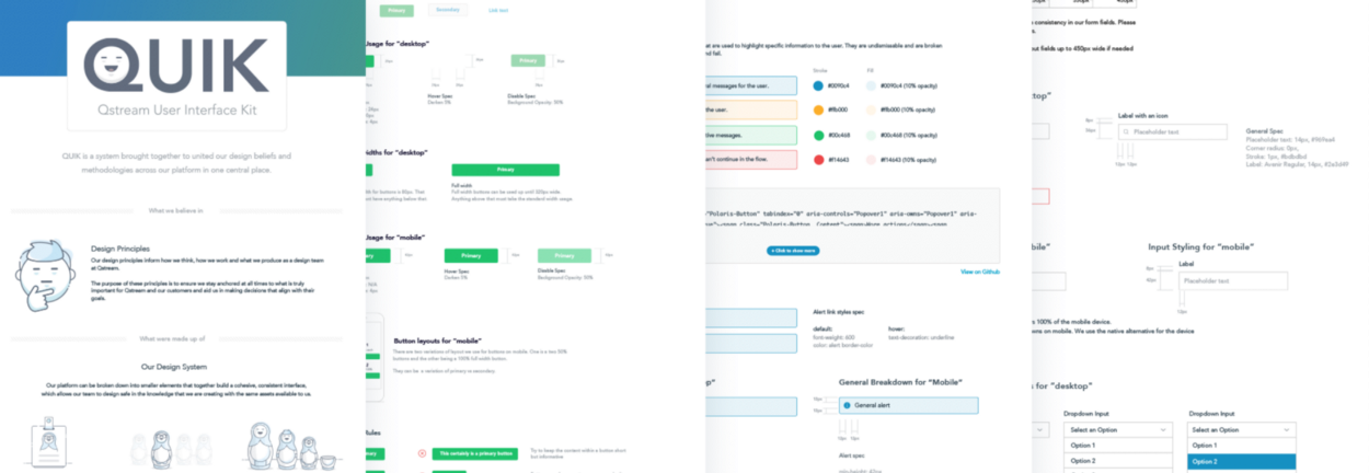
An introduction to our design system – QUIK
Over the last few years I’ve been heavily involved in creating design systems across various companies, from startups through to well-established organisations. My latest venture has been creating our design system for Qstream.
From very early on in my time at Qstream, I realised how essential it was that we introduced a fresh, working system to our design team as quick as possible. Inconsistencies and poor design choices plagued the product, and as the product and the design team expanded, it was vital to steady the ship and create a language that each designer could totally.
And with that, we began to create our new design system, aptly named QUIK – Qstream User Interface Kit.
Step 1: Inconsistencies
Again, I’m not going to go in too deep for the process as to how we created the system but I’ll give a quick run through as to how we got out of the weeds.
The first thing to do was to do a total audit of the visual components within the product. Brad Frost has put together a great article around how you go about doing a UI audit if you’re interested.
This can be an awful, time consuming, monotonous task, but it is so beneficial. It a) allows you to get a total understanding of where the main inconsistencies lie b) gives you a really good overview of what elements are important and used consistently throughout the product c) gives you a crash course on how exactly the product works and d) allows you to show the wider business the frailties of the existing visual system, and exactly why a new, consistent design system is needed.
A snippet of our UI Audit outlaying the inconsistency across the platforms UI.
Step 2: Creating the Elements
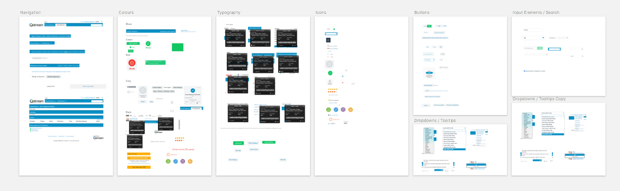
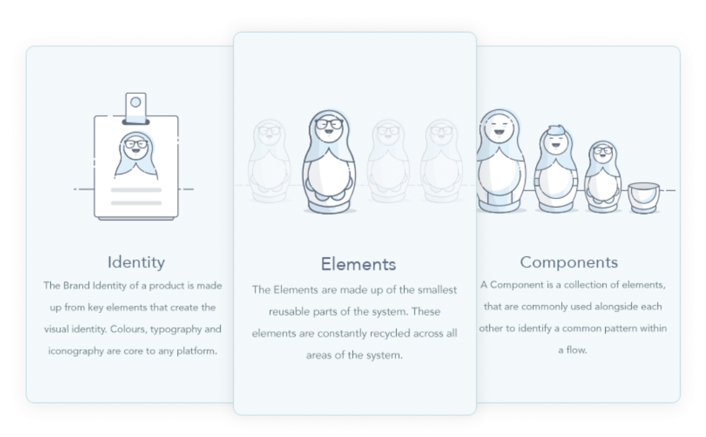
We broke down our system into 3 different entities.
- Brand – The Brand Identity of a product is made up from key elements that create the visual identity. Colours, typography and iconography are core to any platform.
- Elements – The Elements are made up of the smallest reusable parts of the system. These elements are constantly recycled across all areas of the system. (Buttons, inputs)
- Components – A Component is a collection of elements, that are commonly used alongside each other to identify a common pattern within a flow. (Alerts, tables, cards, etc)
The next step is to prioritise, based on the UI audit, what elements are most commonly used across the product. These will be the first areas you tackle first.
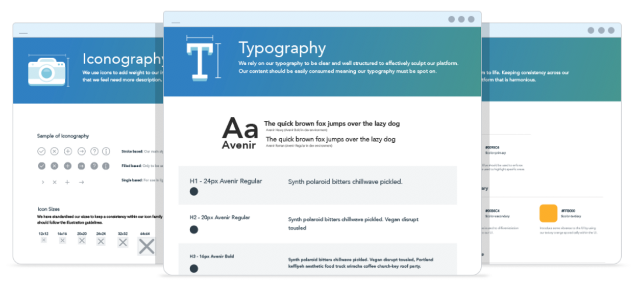
Once we identified the key elements for the system, it was time to start creating the style and rules around each area. We tackled colours, typography, spacing and general iconography first before moving onto the more formed elements such as buttons, inputs etc.
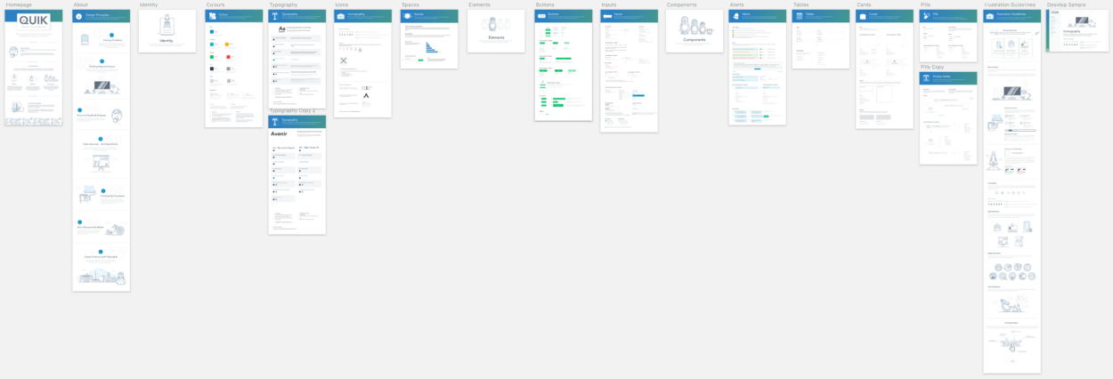
A birds eye overview of our whole System to date.
Obviously the deeper the system goes, the less frequent the elements are used, but it’s all part of growing the system and making the overall language as consistent as possible across all aspects of the product.
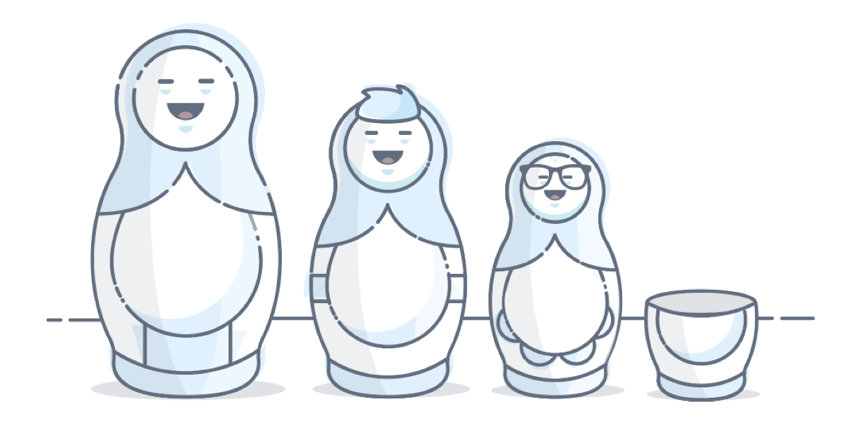
(We also have another project ongoing around our illustration style but I’ll save that for another article, you can see more around it here)

A sample of our illustrative style used across the platform.
Step 3: Implementation
We’re currently in this phase. To be honest, we’ll probably never move out of this phase. One thing that you’ve got to realise before you take on a challenge like this is that it will never end. You’re developing a product, it’s not a project that will eventually end. It will constantly be evolving and growing.
All you have to do is to take a look at how product teams have restructured to cater for design system teams, many opting for designers solely focused on working directly on their design system, nothing else. The system has become an integral part of a products core. When created properly, a design system creates focus, clarity and confidence and in turn will create consistency across the product and will speed up the turn around of product development. What’s not to love!
“A design system isn’t a project. It’s a product serving products.” – Nathan Curtis
Tying up the Systems
Creating a design system that works across the product is one thing. We’re also in the middle of creating brand guidelines as well as outline our design principles. (Again, more articles to follow regarding our process).
We feel it is key to create a solid foundation across all aspects of design before we move any further as without the proper scaffolding in place, it will cause issues down the line. Creating a solid set of guidelines and principles will help guide us in the correct direction when we start scaling up.
The plan, once we have QUIK to a level that we feel is consumable, is to create a Playbook that will house the key features of our products core personality and entity.
- Brand Guidelines – a set of guidelines that will introduce our brand personality as well as outline key characteristics such as tone of voice, colours, logo constraints etc.
- QUIK – a system brought together to unite our design beliefs and methodologies across our platform in one central place.
- Design Principles – The purpose of the principles is to ensure we stay anchored at all times to what is truly important for Qstream and our customers. They will aid us in making decisions that align with their goals.
Going Forward
We’ll strive to create consistency across our platform. We’ve still a long way to go. Everyone, from all angles of the product team, is fully aware that this is a monstrous challenge, but we’re also equally aware of its importance for the scalability of the product.
The post The Benefits of Creating a Design System appeared first on Speckyboy Design Magazine.
]]>The post Creating a Design System Language appeared first on Speckyboy Design Magazine.
]]>But how exactly can a product benefit from having a living, breathing design language? I’m going to try break down the very basics so you can understand why it’s needed.
“Creating an underlaying language will unite our design philosophies and methodologies across our platform.”
So, Why Do We Need a Design Language?
There are two ways of looking at it, from an internal and an external perspective.
Internal:
It creates a holistic perspective to ensure we’re all adhering to the same methodologies and patterns as a team. Every team member should be inline with the concept that we’re promoting and should be able to reference the design principles against any project they are currently working on.
The main goal of a design language is to create focus and clarity for designers. A design language is like any language. If there is any confusion it will cause a breakdown in communication.
External:
Having a cohesive Design Language creates harmony within a platform. For onlookers, standardised colours, interactions and patterns creates a sense of familiarity and security. A well planned and well executed Design Language is the key to a gratifying experience.
For instance, if you walk into a Starbucks in Iceland, you will recognise a lot of similar touches to your local Starbucks down the road. Familiarity brings a sense of comfort and security to the user. Introducing design constraints on individual elements within a platform creates consistency at a higher level.
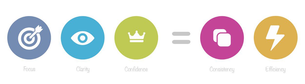
A successful Design Language will:
- Focus: allow the designer to focus clearly on the project at hand rather then to be diverted by other distractions.
- Clarity: allow the designer to think clearly about our design beliefs as well as the design constraints in place across the platform.
- Confidence: allow the designer to have complete confidence in what they are designing and that it is inline with others in the team.
- Consistency: create consistency across the product which in turn will create a secure, familiar experience across the platform.
- Efficiency: create understanding across the teams, meaning less time consumed concentrating on the less important details.
Basically, if your designers are focused and understand the design language, it will give them confidence, which in turn will help the business at a higher level as it will create consistency and efficiency.
Building the Foundations…
Design Principles
Having solid design principles in place, that the whole team has contributed to, ensures that we’re all adhering to the same methodologies and patterns as a team. Every team member should be inline with the concept that we’re promoting and should be able to reference the design principles against any project they are currently working on.
Tone of Voice
Its important to create a consistent voice for our product. Each designer (or whoever is involved) should be aware of the approach needed when writing content. Having consistent content is a very large part of creating a consistent user experience and all designers should try to align all content accordingly.
Team Values
How do we work together as a team? It’s important that everyone pulls in the same direction and everyone agrees that the chosen values are important to creating a happy working environment.
There are obviously a whole lot more elements you can establish to create a core foundation for your design identity. The above is just the tip of the iceberg. Every company is different so feel free to expand on it as much as you feel is right to explain the methodologies of your approach.
Visual Identity:
Creating the visual identity isn’t something that will be created overnight. It takes time. Sometimes it’s as clear as day as to what is needed, other times it takes time for the building blocks to fall into place.
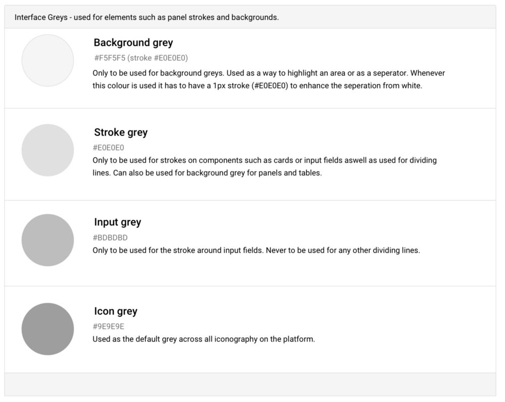
Once in place, it’s important that the fundamentals are captured and documented at a high level. The likes of use of colour, typography and style of iconography is key to creating consistency across a platform.
- Colours: What is the colour palette used on the platform? Explain how, where and why we use certain colours.
- Typography: What typeface is used on the platform? Summarises rules around weighting, sizing, vertical alignment etc?
- Iconography: What is the generic style for icons? It will explain the rational as to why we have specific styles for different icon families.
- Grid/Layouts: What grid system is used across the platform? Explain the use of the grid and the high level idealism of our layouts.
- Interactions: What do people expect to see when they interact with our site? Give an overview of our standard interactions.
- Animations: How do we approach animations? Explain the reason for animations on the platform and our constraints around using them.
- Design Resources: A central point for assets to be easily downloaded for external partners. Colour swatches, logo’s, icon sets etc.
The Next Steps:
You probably are fully aware of how important a design language is within your platform but saying to yourself ‘where do I start?. This article is pretty high level. Creating a design language goes far, far deeper then what I have identified above. The creation of the styleguide and in turn the development of a component library is the evolution of a design system.
So here is a process that I’ve put together that should help you focus on exactly what is needed to get the ball rolling:
Do a UI Inventory Audit
Before you start anything, its best to identify how inconsistent the current build is. This works in two ways. It helps identify the reason as to why you’re doing it, to identify how inconsistent everything is but it should help you get the backing of the business as to why exactly you’re creating the design system; to create consistency across the platform. Brad Frost has put together a great article around how you go about doing a UI audit.
Prioritise Your UI Elements
Im sure every design team has different priorities with regards what they feel is crucial to creating consistency but there are generally some elements that are critical to creating the basics. The likes of colours, typography and iconography is a great place to start.
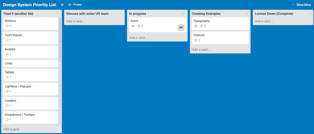
Work closely with the design and development team to create a list of priorities based on your UI audit, this should guide your roadmap for the foreseeable future. I’ve found using a Trello board as a way to keep a priority list up to date is a great way of working.
It allows you to 1) create your list and set them in a line of priority i.e what are you going to tackle first and 2) allows you to track exactly how far along you are with each component.
Start Discussions with the Design Team
So now that you’ve identified exactly what you’re going to be tackling first in the priority list, its time to sit down with the design team to get all ideas and opinions out around the first components needed.
There are various approaches as to who owns the design system project, but for this instance I’m going to take the instance that there is one sole designer who is in charge of control of the project.
This means it’s up to you to discuss every aspect of the component with the designers who will, in time, be using the design language. This is extremely important to ensure that the designers all feel as if they have had an input into what is being created.
Document all Instances
Its time to start making some decisions. Document what you are creating, ensuring that you’re catering for all instances needed. Its vital that what you are creating is not a subjective decision.
You have to have rationale as to why you are making these decisions as it will allow you to explain your decisions to the design team down the line.
See if it Works
The next step is to try out your decisions. Its very easy to make decisions on paper but when you are putting them into practice it might turn out that some decisions just don’t work. Try out some examples of the new style using current designs.
Lock it Down
One you are happy with the outcome, and you have buyin from all parties, its time to lock it down and educate the rest of the team as to how and why these elements are to be used. It’s important to remember that although you are locking down the styling, that if you feel certain elements aren’t working, that you can change it if needs be.
Move to the Next Element
Once you have educated the team and are comfortable in the knowledge that the designers are respecting your decisions, its time to move onto the next set of elements. Its up to you as to how many elements you take at a time, but you should never bite off too much.
It will just distract you from really focusing on the smaller details. My starting preference would be – Colours, typography // Icons, input fields // Tables, Lists // etc.
Once everyone is educated as to what the new style is, its important that all designer and developers are implementing the styles properly.
Weekly checkins are vital to monitor the style choices to ensure that everyone is working off the same design decisions. Using products such as Craft by Invision really help bring consistency when moving forward.
How to Gauge Success:
“The Design Language is not a success until the company starts using it and finding value in it.”
Examples of Design Languages:
- https://www.ibm.com/design/language/framework
- https://www.lightningdesignsystem.com/
- https://design.atlassian.com/
- https://material.google.com/
- https://ux.mailchimp.com/patterns
- https://standards.usa.gov/
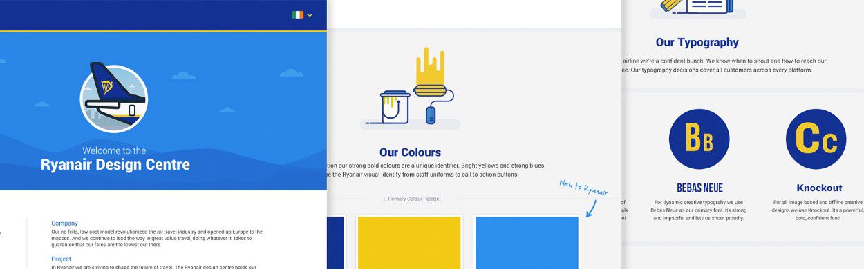
Also, here is a case study that I created for a recent design overhaul that I was involved in: Ryanair Design Centre.
“The biggest existential threat to any system is neglect” – Alex Schleifer, VP of Design at Airbnb
The post Creating a Design System Language appeared first on Speckyboy Design Magazine.
]]>The post Creating an Illustration Guideline appeared first on Speckyboy Design Magazine.
]]>Why is it needed?
Identifying the core values and a high-level rationale as to why you need illustrations is key to outlining your style. Having a consistent style will obviously create an overarching style that will create harmony across you illustrations. It will mean that various illustrators can tackle illustrations on the same platform safe in the knowledge that their work will look part of the family.
Highlighting key areas such as a colour palette or the stroke weight are obviously vital to creating solidarity across a style. But outlining information such as the values attributed for the illustration style, or what you want to achieve from having them on your platform are also just as important.

A sample of some exploratory styles
Don’t just jump in…
Before you start any project, it’s important that you understand exactly what you or the stakeholder wants to achieve from the project.
I generally break it down to the following few questions to give both myself and the stakeholder a better understanding as to what we’re trying to get out of the project.
1. Goals
Why do you want to introduce illustrations to the platform? How would you deem the project a success?
2. Existing Styleguide
If there are existing styleguides already in place, it obviously helps a great deal. It doesn’t have to be illustration based. Core design guidelines, brand guidelines, anything that feeds into the overall brand identity of the platform will help create focus.
Particularly existing colour palettes and how heavily you would expect the illustrations to lean on specific colours available. Even if the company has an existing colour palette, it doesn’t specifically mean that the illustration style should follow this. You’re illustrations may need to stand out away from the interface and using the brand colours might work against itself to a certain extent.
3. Values
How do you see the illustrations fitting into the platform. How do you feel the illustrations should shape your brand identity. Will they be fun, quirky, soft, passive, detailed, elegant, sharp etc. It’s basically a general synopsis of the style.
Even before you start you should have a general idea of how you want the illustrations to work within the interface, or how you want to use them, to educate the user, for basic empty states, or maybe you simply just to inject some personality into your project.
4. Moodboards
Create a moodboard of styles that you feel would be a direction that you feel might be a good fit for your product. This is always a really good way to get to to the point where the stakeholder can literally point at a style and say ‘I want that one’…. Obviously they can’t have ‘that one’ but it will give the illustrator a really good idea of what the stakeholder wants.
When creating a moodboard, they don’t need to be totally consistent. It’s more just to give an overview of what direction you think may work. There are various outlets to do the research, specifically Behance, Dribbble, Pinterest, iStock or even good old Google Images can work. It’s all about gathering as much information as possible before you ever go near an artboard.
Don’t just jump in. You have to figure out why you’re doing it first
Time to Pull up your Sleeves
Luckily enough, here’s one I prepared earlier. Having recently joined Globoforce, I was tasked with creating an illustrative style that would be used across our white-label platform.
Our main aim for our illustrations is to inject some personality into areas on the platform that felt unfinished. Or at a very high level: To create an overarching illustrative style that will introduce consistency across our platform.
Explore, Explore, Explore
No one said it was going to be an easy, quick process. We explored various styles that ended up in the bin. It’s all about exploring ideas. Nothing is really wasted, it all plays some part in finding the final solution. It’s just another hurdle you jump before getting to the finish line.
Some styles work, some don’t so you’re going to have to be willing to dump the ideas, that may be good, but just don’t work for what you’re trying to achieve for this particular project.

Our Language for Illustrations
It is import that everyone is on the same sheet when it comes to terminology. You have to create a language of terms that everyone is comfortable with. Terms that people understand. It doesn’t have to be too detailed, just a specific set of words that allows stakeholders and designers to be able to speak about illustrations without getting confused.
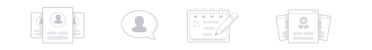
Our Icons
We use icons across the site to give prominence and to enhance the usability of specific elements across the interface. They can be used from 12px up to 64px. We have more rules around how to use iconography in our UI styleguide.

Iconography
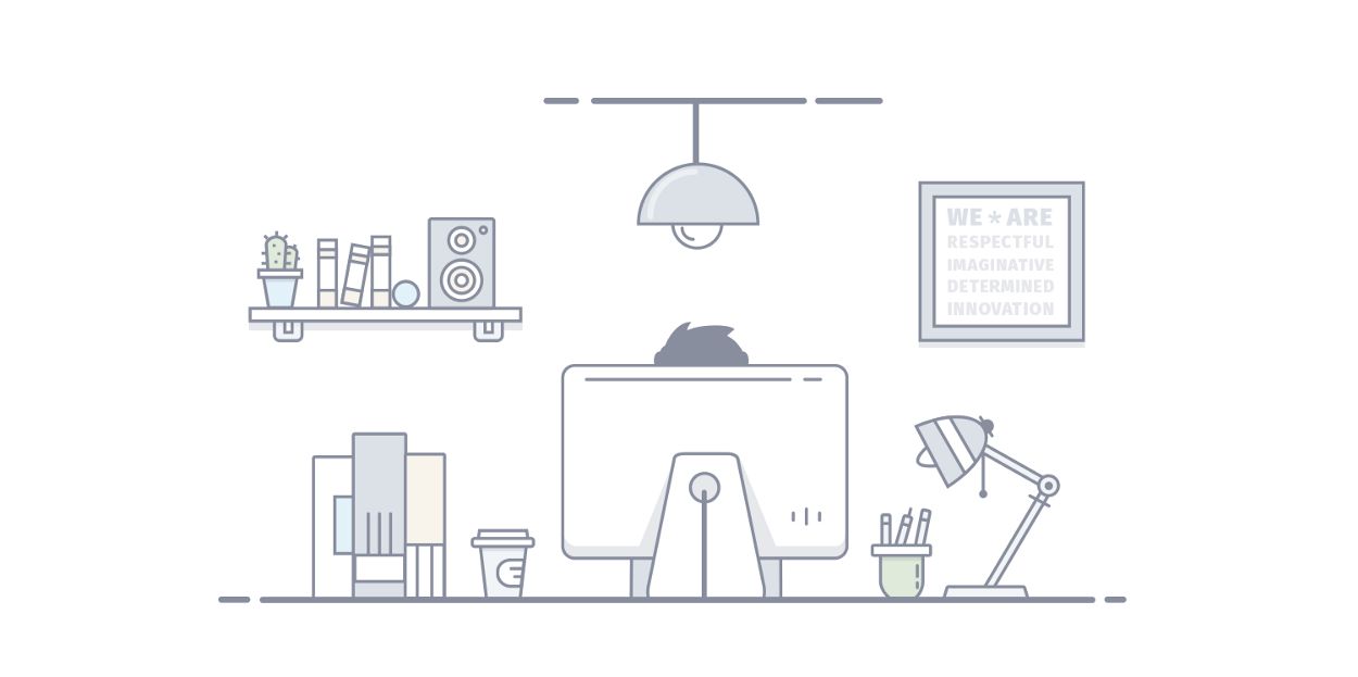
Our Spot Illustrations
A spot illustration is used to help showcase a small feature or explain an experience. They’re lightweight, not too busy but are there to help enhance the flow by bringing the interface to life and delighting the user.
![]()
Spot Illustrations
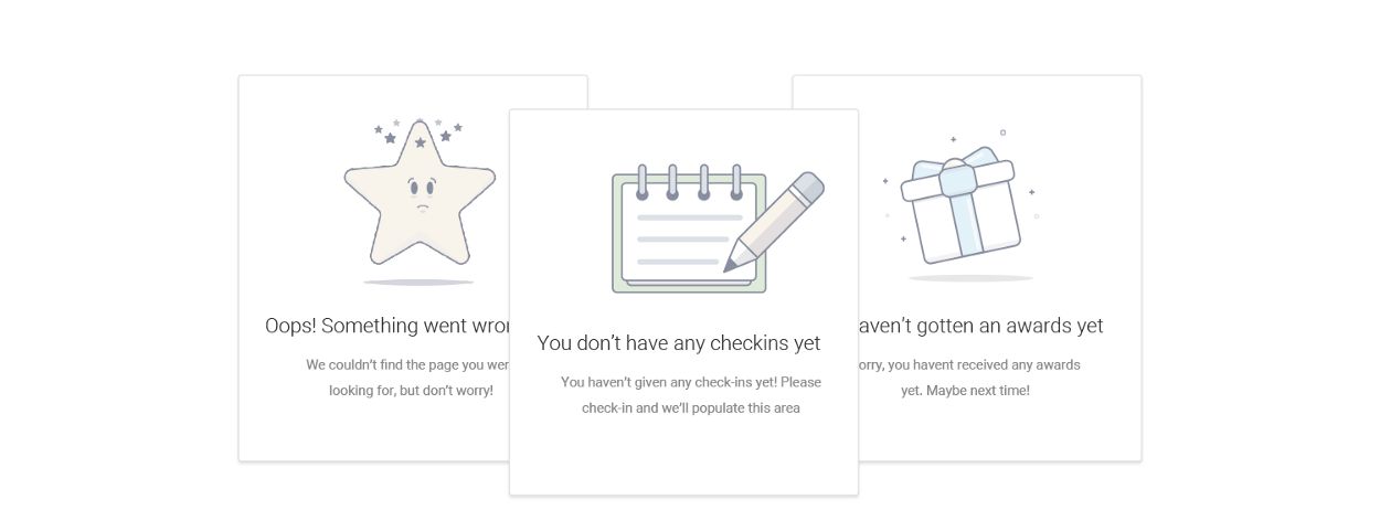
Our Empty State Illustrations
An empty state illustration is used to explain a feature but should never be the primary focus of the component. It is used to main as a way to address the need to fill an empty area but it also gives us a way to energise a possible lifeless area.
Empty State Illustrations
Our Scene Illustrations
A scene illustration works on a larger space and allows the user to explain a feature or a scenario with a more detailed driven approach.

Scene Illustrations
Our Approach
Illustrations can be use illustrations to bring our interface to life. They’re used to educate the user and help draw attention to specific features across a platform.
“Used to delight the user in an otherwise lifeless area”
Keep it Simple
As our product is a white label product, the illustrations will be used across a huge range of varying clients. For this reason we try to keep the style and concept as simple and as passive as possible.
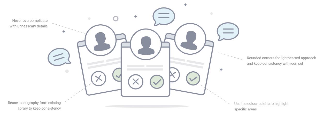
Use of Characters
We refrain from using characters where possible. The use of a character opens up questions regarding race and gender, and due to our wide range of clients it’s best to simplify as much as possible.

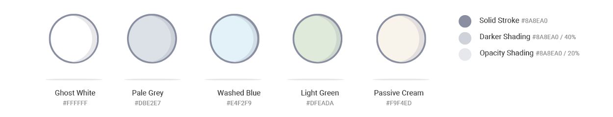
Colour Palette
Our colour palette was chosen carefully with the business in mind. It’s passive nature was chosen to complement our wide range of clients. Our aim is for our illustrations to delight the user without stepping on any brand team toes.
Colour Balance
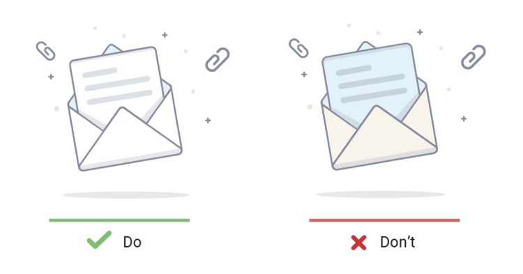
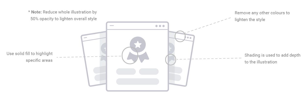
We generally refrain from using too much colour in our illustrations. We try lean on our ‘Ghost White’ as much as possible, only introducing the rest of the colour palette to give the illustration balance.

Ghost white is our most frequent colour choice. Try use it for the key elements in the illustration
Reasons: The colour should not be used as a subjective choice. The illustration should be passive and not too noticeable. Colours can be used but we need to be selective when they’re being used. Our style is passive, not colourful.
Colour Palette for Empty State Illustrations
We remove the options for the Empty State illustrations. We only use ‘Ghost White’ along with the Solid Stroke option. We allow for shading but never use any other colours. We have a 50% opacity on all illustrations to reduce the weighting.
Stroke Breakdown
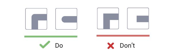
We use a consistent default smooth brush with a 6px stroke. We also allow for 3px stroke if there is smaller details needed in a tight space. We use a rounded cap at all times to work alongside our rounded corner approach.
*Note: We never deviate away from using #8A8EA0 as our stroke colour.

Stroke Caps
We use a rounded cap at all times to work alongside our rounded corner approach.
At the end of the day…
It’s pretty simple when you break it down. The main aim for an illustration style is you create a style that is consistent, recognisable and brings value to the platform. There are generally 3 steps you have to do to deliver:
- Identify why you need illustrations
- Create a style that works for you and your business
- Document your style so that going forward you have a solid style that will be easily cloned across other concepts.
-
When Illustrations Matter to the Design Process https://speckyboy.com/when-illustrations-matter/https://speckyboy.com/when-illustrations-matter/#comments Wed, 26 Oct 2016 20:00:16 +0000 https://speckyboy.com/?p=83571 Lately I have found myself focusing more and more on an illustrative approach when I think about how to develop the true identity of a product. I’ve found it a... The post When Illustrations Matter to the Design Process appeared first on Speckyboy Design Magazine.
]]>I’ve found it a lot easier to build a unique, memorable style by introducing illustrations to the mix. Maybe it’s because it’s giving me another stick to beat the product with to sculpt its true brand identity.
Bring a Twist to Reality
Photography is often dull, forgettable and bland. Finding the right image that you need to sell your cherished product, a product that you’ve slaved over, caressed, truly loved, can be virtually impossible. Nothing is good enough for your digital baby. Trawling through stock image galleries, looking at poorly paid models in ridiculous poses can be a difficult task, to say the least. Photography is limited. Unless you’re willing to get a photographer involved, you are pretty much stuck to whatever stock galleries have to offer.
This is where illustration comes into play. Illustrations have been around since the local cave man wanted to explain to his mates what he had for his dinner. When done right, an illustration can tell a thousand words with one simple swipe of a cave man’s stick.
You can go far beyond the limitations of photography. The rules can be easily bent. In fact, illustration is far more effective when we take a sidestep from reality and jump knee deep into something away from the norm. Illustration design gives us a chance to create a unique, memorable style that will live long in the memory of our users.
Enhance the Brand Identity
At times a brand can be rather stagnant. We use the likes of a content strategy to bring a dynamic approach to our brands. But visually, we’re often limited with regards to what we can do to enhance our brand identity from a product design level. We’re often cornered as to how we can express the true identity of a brand.
The use of illustrations across a platform can help drive brand character. For example, the use of strokes in an illustration can portray simpleness, the use of vibrant colours or rounded corners can push a fun and playfulness approach. It is important that the illustration style mirrors the brand values.
Help Guide the User’s Experience
Introducing illustrations across various areas of a design can help guide the user experience. It’s becoming more and more common for the likes of onboarding screens to be driven mainly by illustrations. What used to be a space for content strategists to flex their writing muscles to explain how a product should work has been captured by product owners drawing stick men explaining to illustrators how their product works.
“Never underestimate the simplicity of the general public”
Generally, I find, the user doesn’t read all that much when skimming through a flow. Designers often rely too heavily on the use of content to explain certain aspects of a flow and then when you test it, you are left pulling your hair out as the user looks everywhere, but at the line of text they should read that explains exactly what is needed. Less is more.
Introducing Illustrations to Europe’s Biggest Airlines
Recently, I was lucky enough to be heavily involved in the site redesign of one of Europe’s biggest airlines, Ryanair. With over 40 million visits monthly, it certainly was a daunting yet incredibly exciting project.
One of the arms of the project was to lead a team of designers in creating a new illustrative style for the Ryanair platform. As Head of UI at Ryanair, I was tasked with coming up with a redesign that was unique and memorable and I felt giving a fun, illustrative twist to the site would certainly differentiate ourselves from the competitors.
It was early on in the project when we decided that leaning heavily on illustrations would give us an edge, so we set about putting some ground rules in place as to how exactly we were going to approach the project.
- What is needed exactly?
Firstly we met with stakeholders to get buy-in as to exactly what way they felt we should tackle the style. We had already delved deep into this exploration earlier in the project when we were figuring out the broader UI styles, so it was easy enough to get an understanding as to exactly what we needed.

An early exploration into an illustrative approach- How are we going to use them?
The next step was to figure out how and where we were going to use illustrations on the site. Everyone on the team agreed that we should try to incorporate illustrations into both our ancillary products as well as to the destinations that we flew to. So myself and another illustrator on the team, Chris O’Sullivan, took it upon ourselves to try flesh out a style that fitted our unique brand. Our main approach was to try to keep the illustrations as fun, colourful and as simple as possible, as we felt that that would line up nicely with what we were doing on the user interface side of things.
- How are we going to get them done?
We split the two illustration families up; Chris took the product illustrations while I tackled the destinations list. We were in the lucky position that the style was effectively up to us to create, control and push forward. The stakeholders on the project had totally bought into what we were trying to do so it gave us a lot of confidence to really push the illustrative style to work hand in hand with the overall interface.
- How can we develop the library?
As the project developed, we searched for areas where we could push the catalogue of assets even further. Introducing characters into the mix gave us a chance to reinforce the fun, playful approach but also gave us the opportunity to drop the character into various scenes enabling us to explain various complicated scenarios through illustration rather than wordy content. Basically, the more assets we had in our library, the more flexibility we had to expand on our illustrative approach across the platform.

- Now we have them, how do we use them?
Once we had settled on a general style; the next step was to carefully introduce the correct amount of illustrations across the platform. We didn’t want to totally overwhelm the site with illustrations, but equally, we wanted them to be ever present so that they would have an input into the overall experience of the site.
- What do we do going forward?
A key part of the project, as with product design projects in general, was enforcing consistency. A styleguide was created outlining constraints around colour palettes, stroke widths and the rules around the overall simplicity of the concepts. We felt it was vital to have this documentation going forward especially if a new illustrator was given the job to carry our project forward.
I’ve since left the team at Ryanair, but I’m confident that the legacy that we built will remain a key element of the brand identity of Europes biggest Airline for years to come.
You can see more of what we achieved over at a recent case study I created around the subject here
At the End of the Day
I believe it’s time to embrace illustration as another arm of your visual identity. Don’t get me wrong, it’s not for everyone. I just believe you’re pretty naive if you’re willing to overlook this extra string to your bow when trying to build a stronger identity. After all, a picture is worth a thousand words
Feel free to pick my brain (or whats left of it) over at:
// Twitter // Dribbble // Behance // Portfolio site //The post When Illustrations Matter to the Design Process appeared first on Speckyboy Design Magazine.
]]> - What is needed exactly?
You can see the full case study here.
You might also like: When Illustrations Matter to the Design Process.
The post Creating an Illustration Guideline appeared first on Speckyboy Design Magazine.
]]>